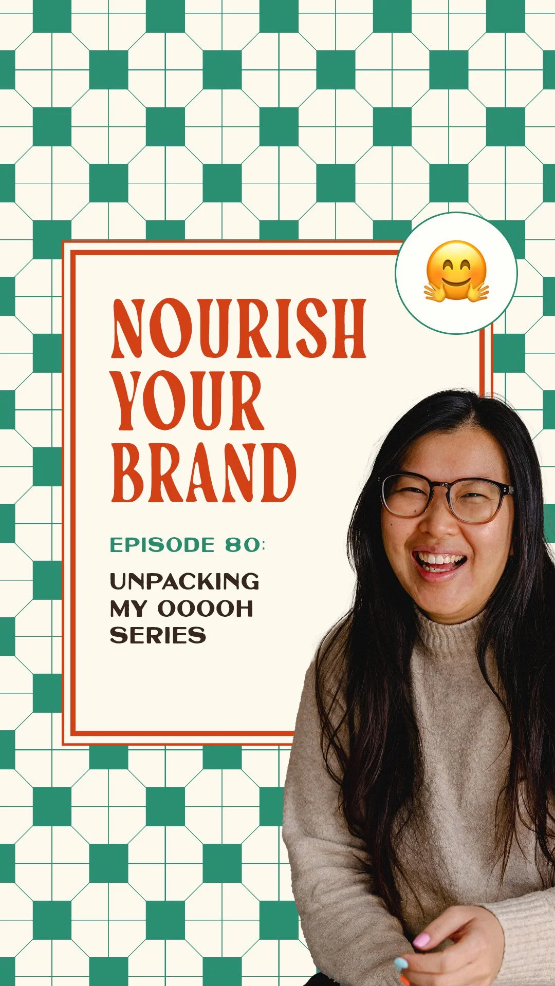
Ep 80. The Small Offer Branding Details That Make People Go Ooh
Nourish Your Brand · Episode 80
Recently I made a whole series on Instagram where I nerded out over offer branding, called A List of Things That Made Me Go Ooooh About Your Offer Branding.
It was so much fun, but I never got to unpack the reasoning behind each thing I picked out.
So this is the round-up: why each choice works and why I'd make it for a client, because "ooh" is never an accident, it always comes from a decision made on purpose. If you want to watch the series too, it's in four parts (colour, theming, imagery and typography) over on my Instagram.
Credit where it's due, I borrowed the format from Rachel Emma Waring and put my own twist on it, to showcase what good creative looks like in offer branding and give you some inspiration to take away. Let's get into it.
Colour
Colour drenching. Going all in on one colour for your offer. It's rare, because most people play it safe with neutrals or a multicolour palette for variety. But full commitment to one colour stands out instantly, and every time you repeat it the offer gets more recognisable and more established in your audience's mind, so they start to know what to expect when they see it.
Unexpected colour combinations. Colours you'd never think to pair, that somehow just work. It shows taste and a bit of risk-taking that a lot of people are scared to try, and your offer is a great place to be more experimental. It's a genuine head-turn, sometimes I see one and think "I wish I'd thought of that pairing first."
Naming your colours. One of my favourite things ever, even if it's not always client-facing. Rather than blue, green or red, it's matcha or blueberry (mine are always food, of course). It turns the whole palette into a personality rather than a list of hex codes, makes the brand feel like a world, and signals that you care about how your brand comes across, not just how it looks.
A colour palette just for your offer, separate from the main brand. It lets your audience spot the offer at a glance without having to work out how it relates to your main brand, and makes the offer feel more considered and more special.
Theming
You know I love theming (much more on that in Episode 17). A theme not linked to your industry creates an odd, memorable association because people react to it, and it takes a little bravery, which signals you're confident in what you're offering.
A theme with its own language gives your audience something to repeat back, an insider language that makes the offer feel like a secret club, and builds the world around it.
A recurring themed moment builds anticipation and becomes a ritual people expect (mine is the bread-and-oven world of the Offer Oven), creating an ongoing relationship clients can talk about.
A theme linked to physical things makes it feel alive beyond the digital, so people spot it in real life, basically free marketing every time something out in the wild reminds them of you.
And a theme you genuinely love, not a gimmick, is one you can always tell apart from a forced one, because the energy comes through when you talk about it, and that energy is what clients are looking for now.
Imagery
A consistent image style signals professionalism; inconsistency (even mismatched lighting) is hard to connect with and quietly erodes trust. It doesn't have to be complicated, just the same colour grading, background or environment, so it feels familiar.
Unexpected imagery shows specificity, it's clearly not generic stock, so it stops the scroll and makes people want to know more.
Behind-the-scenes imagery removes the mystery and the intimidation, making your offer feel accessible rather than distant and over-polished, which builds trust because people see something real.
And imagery that creates a world is the difference between showing what your offer is and selling a whole experience, it lets people imagine themselves inside the offer before they've bought, connecting the moment they find you right through to being a client.
Typography
Unexpected font pairings show a level of taste that's hard to come by. It's a small detail people often skip or make trendy (so they blend in), so getting it right earns that flicker of recognition.
A word mark for your offer name (yes, technically logo territory) makes the offer feel like a real, tangible thing that exists, not just a header on a sales page.
And handwritten fonts soften the brand and make it more human, which works especially well for personality-led offers where people are buying into you, bonus points if it's derived from your actual handwriting.
Ask yourself this week
Which of these small choices could you commit to for your offer, and actually repeat?
Is there anything visually identifiable that belongs to your offer specifically?
Are your choices intentional and consistent, or made on the fly?
Where to go from here
None of this is complicated. Most of it is just clear, aligned choices used consistently. It's the accumulation of small, intentional decisions that compounds into something recognisable, and every "ooh" moment came from someone deciding on purpose instead of winging it. That, to me, is the whole difference between an offer that blends in and one that doesn't.
If you'd like to work out exactly what your offer needs to stand out, connect and be unmistakably yours, that's what I help with inside the Offer Oven, my 7-day branding sprint. Book a free Brand Pairing call if you'd like to see whether branding your offer is the right move. And if you've got ideas for another series like this, send me a DM, it was so fun to make.
Related episodes
Ep 47: What is offer branding?
Ep 17: Why theming your offer makes it irresistible
Ep 8: How to choose the right colour for your brand
Resources mentioned
Offer Oven – my 7-day sprint to brand your signature offer
Brand Pairing call – a free chat to see if branding your offer is the right move
The A List of Things That Made Me Go Ooooh About Your Offer Branding series on Instagram: colour edition, theming edition, imagery edition and typography edition
Come say hi on Instagram: @studiocoya
Here's More…
Do these details really make a difference to sales? Individually they're small, but they compound. Consistent, intentional choices across colour, theme, imagery and typography are what make an offer recognisable and memorable, which is what makes it easier to choose.
Where should I start if my offer has no branding yet? Pick one area, colour is often the easiest, and make one clear choice you can repeat everywhere. Consistency matters more than complexity.
How do I do all four areas cohesively? That's exactly what the Offer Oven is for: pulling colour, theme, imagery and typography into one branded world for your signature offer in seven days.
About the host
I'm Aiza, the brand chef behind Studio Coya, a branding studio with a food-themed twist. I help established coaches, creators and service providers brand their signature offers so their best work looks as good as it actually is, and sells like hotcakes.