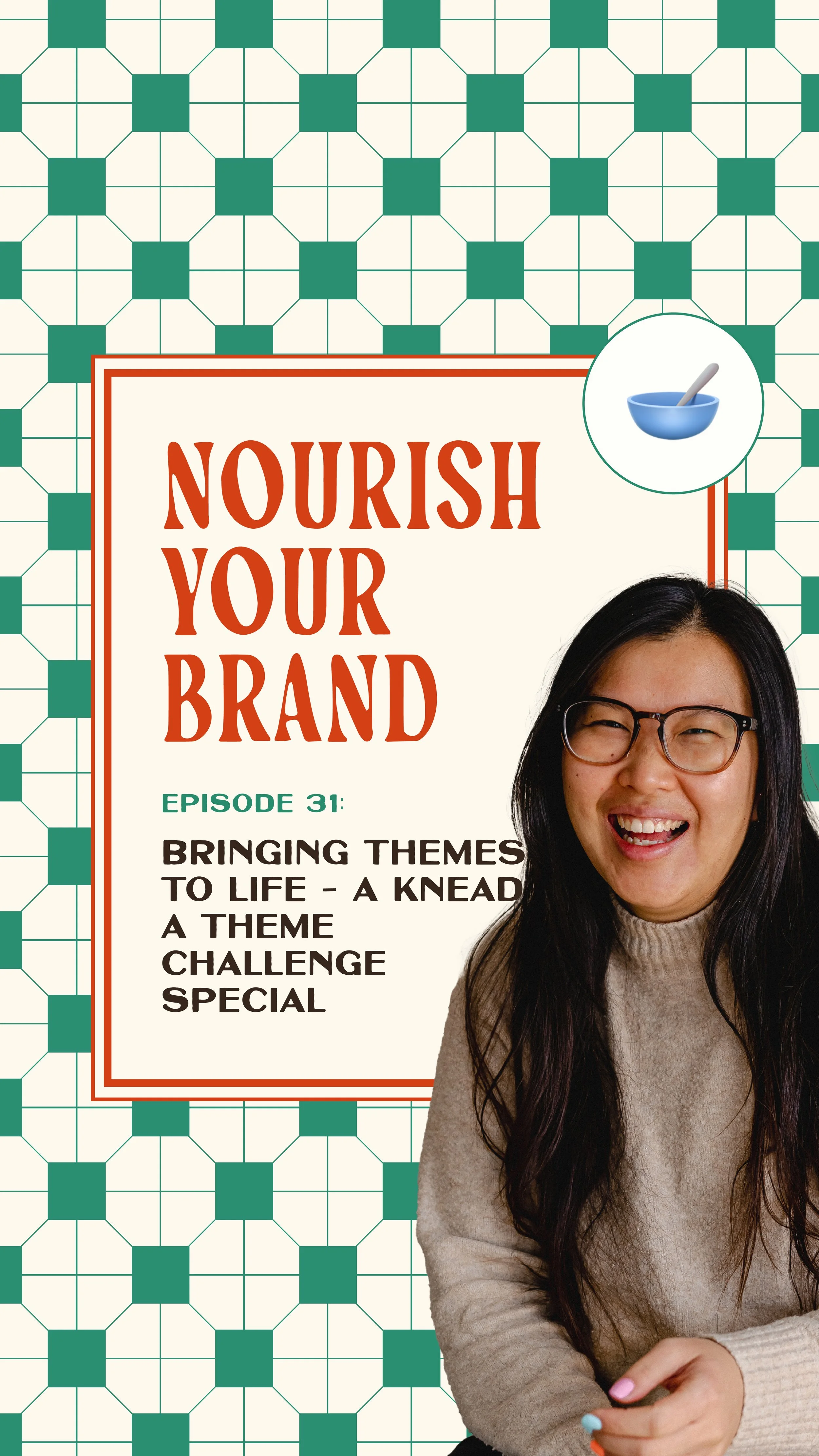
Ep 31. Bringing Brand Themes to Life with Real Examples
Nourish Your Brand · Episode 31
Today's a special one. We're diving into the creativity that came out of my free Knead a Theme challenge, where people uncover a unique theme for their brand or signature offer. I'm going to spotlight some of the themes participants submitted and how I'd bring each one to life visually. A quick note: these are first-sprinkle creative takes, not fully baked deep-dives. Let's get into it.
Seven themes, brought to life
Morin, theme: the kaleidoscope. Warm, curious, insightful. I'd use a warm palette with the glowing pinks, purples and oranges you see through a kaleidoscope, plus mirrored patterns (even mirrored video) to convey depth and movement.
Katie Bell, theme: the American diner. Empathetic, dedicated, supportive. Rather than going gimmicky, I'd pull elements like checkerboard, wavy lines and stripes, keep her existing pinks and teals instead of classic diner red, and add a vintage slab serif for that retro feel.
Amanda, theme: the phoenix. Welcoming, empowering, creative. This is about mood, not a literal bird, so no feather logos. Fiery gradients of deep orange and red grounded with dark purple or grey, plus glowing particle effects.
Chantelle (House of Battencourt), theme: home. Moody, classic, vintage, nostalgic. A classic vintage serif paired with a handwritten script, and a moody palette of dark greens, deep burgundy and dark wood tones warmed with cream.
Isabel (Fairy Fox Digital), theme: the rainforest ecosystem. Bold, thriving, simple. Overlapping leaf shapes and branching patterns as a background rather than literal rainforest photos, lush greens and earthy browns with a bold tropical hue like magenta, and a modern sans serif.
Harriet, theme: the outdoors. Connection, considered, grounded, supportive, excitement. Natural adventure imagery, warm greens and browns, sky blues and sunset oranges, with subtle icons (mountain peaks, signage) used to point the way without feeling gimmicky.
Bridie, theme: depth. Approachable, nuanced, permission-giving. Layers and shadowed shapes for depth without going full underwater, ripple and wave graphics overlaid on her existing photos, a grounded geometric sans serif plus a highlight font with movement.
The thread that ties them together
Notice that across all of these, the theme is never about saying "look, I have a theme." It's about aligning it with your visuals, your messaging and your decision-making, and using it with restraint so it never tips into gimmicky. That's what turns a theme into a cohesive, stand-out brand. (If you want the story of how I learned that myself, it's Episode 29.)
Ask yourself this week
If you've got a theme, how would it actually show up in your colours, type and graphics?
Where's the line for you between "on theme" and "too gimmicky"?
Does your theme guide your decisions, or just decorate your posts?
Where to go from here
Theming is only one piece of the branding puzzle. To turn a theme into a fully realised identity, you need the strategy and design around it. That's exactly what my Brand Chef's Special is for, two bold, distinct identities, one for your business and one for your signature offer, working together seamlessly into a grown-up brand that has clients knocking. If you want to start by uncovering your theme first, my free Knead a Theme challenge is the place to begin.
Related episodes
Ep 29: How theming transformed my brand (and can transform yours)
Ep 42: How to theme your brand with purpose (Theming Part 1)
Ep 43: How theming helps you stand out from the competition (Theming Part 2)
Resources mentioned
Knead a Theme challenge – my free challenge to uncover your brand or offer theme
Brand Chef's Special – branding for your business and your signature offer, working together
The Spread – my email newsletter, with new episodes and offer details straight to your inbox
Here's More…
How do I bring a brand theme to life visually? Translate the feeling of your theme into colour, type and graphics, and use elements with restraint rather than literal imagery. The kaleidoscope becomes glowing blended colours and mirrored patterns; the phoenix becomes fiery gradients and particle effects.
How do I keep a theme from feeling gimmicky? Take inspiration from your theme rather than copying it literally, and let it support your message instead of shouting over it. A diner theme is checkerboard and slab serifs, not a literal neon sign.
What's the difference between having a theme and having a brand? A theme is one piece. A full brand aligns that theme with strategy, messaging and a complete visual identity. Bringing both your business and offer together is what the Brand Chef's Special does.
About the host
I'm Aiza, the brand chef behind Studio Coya, a branding studio with a food-themed twist. I help established coaches, creators and service providers brand their signature offers so their best work looks as good as it actually is, and sells like hotcakes.