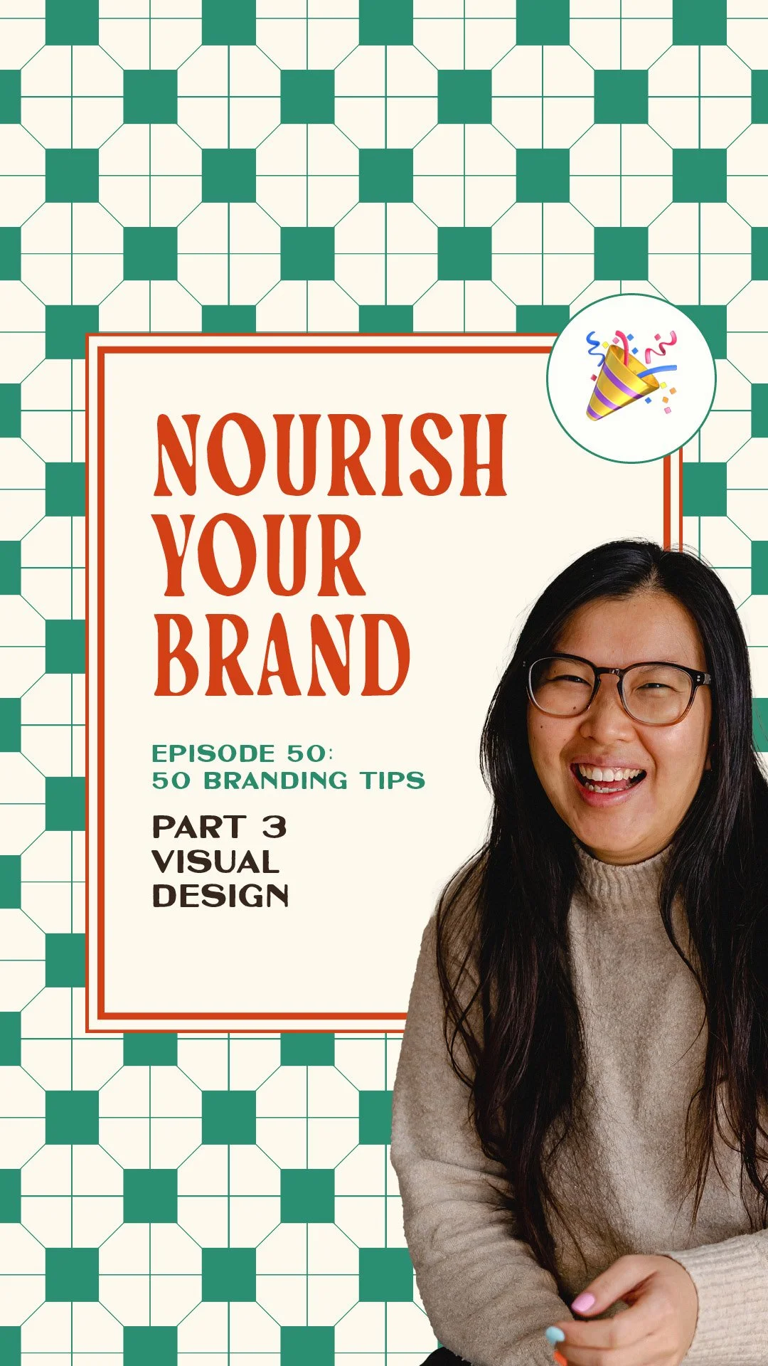
Celebrating 50 Episodes! 50 Branding Tips, Part 3: Visual Design
Nourish Your Brand · Episode 52
Part three of my 50-tip series for episode 50.
We've done foundations and offer branding; now we're into the visuals, the seasoning and the plating.
Visual design isn't just about how things look, it's about how your brand makes someone feel and connect. If your branding feels a bit visually chaotic, this one's for you. Let's get into it.
Ten visual design tips
Set a clear typography hierarchy. Define your headings, subheadings, body and accent fonts, and their scale. It makes content easier to read and gives everything intention, no more random resizing or bolding everything.
Assign a hero colour to your signature offer. If you have multiple offers, a distinct hero colour for each gives instant clarity and recognition, especially when you market them side by side. (Colour deep-dive in Episode 8.)
Define your photography style. Bright and airy, or dark and contrasty? Relaxed or editorial? Decide on lighting, colour temperature and framing, and choose a style you can actually replicate yourself so you're not the bottleneck.
Keep all your brand imagery in one place. A designated folder organised by use case (b-roll, launch, by offer) saves you digging for 45 minutes. Tip: colour-tag your go-to files so you can grab them instantly.
Add subtle visual textures. Grain, overlays, soft gradients, used strategically and consistently (say, always a grainy background for testimonials), add warmth and depth. You notice when it's missing, not when it's there.
Use a layout rhythm across platforms. Consistent spacing, column widths and structure make your brand feel cohesive even when colours and images change. It's the quiet way to build consistency without everything looking identical.
Create templates for the content you post most. Custom, repeatable layouts for carousels, testimonials and reel covers speed up content and train your audience to recognise you. (I only use two.)
Use branded frames or containers. A recurring shape, crop or border becomes visually iconic over time, your brand's signature, and a shortcut to brand memory.
Design one-off assets for limited-time moments. A campaign accent font or seasonal overlay creates a sense of occasion during launches without straying from your core, like switching up the garnish.
Create visual rules of thumb. Not formal guidelines necessarily, just living notes like "never centre more than three lines" or "drop shadows on testimonial screenshots." They remove guesswork, especially if you're not designing everything yourself.
Ask yourself this week
Do your fonts have a defined hierarchy, or do you resize on the fly?
Is your photography style consistent, or pulled from everywhere?
Could someone recognise your layouts even with the colours stripped out?
Where to go from here
Great design isn't about being trendy or flashy, it's about being easy to recognise and remember.
If you want this done for you rather than figuring it out alone, that's what my branding sprints are for, the Brand Kitchen for your business and the Offer Oven for your offer.
Book a free Brand Pairing call to chat. Next up, part four: cohesion and consistency.
Related episodes
Ep 50, Part 2: 50 branding tips for offer branding and positioning
Ep 50, Part 4: 50 branding tips for brand cohesion and consistency
Ep 8: How to choose the right colour for your brand
Resources mentioned
Brand Kitchen – my signature sprint to design your full visual identity
Brand Pairing call – a free 15-minute fit chat
Come say hi on Instagram: @studiocoya
Here's More…
How do I make my brand visuals more consistent? Set a typography hierarchy, use a repeatable layout rhythm, create templates for your most-posted content, and define visual rules of thumb. Consistency comes from structure, not from everything looking identical.
What makes a brand recognisable? Repeated visual cues, a consistent photography style, a signature frame or texture, and a steady layout rhythm. Over time these become your brand's shorthand, so people know it's you at a glance.
Do templates make my brand look lazy? No, custom templates are strategic. They speed up content and train your audience to recognise you. The repetition builds consistency without sameness.
About the host
I'm Aiza, the brand chef behind Studio Coya, a branding studio with a food-themed twist. I help established coaches, creators and service providers brand their signature offers so their best work looks as good as it actually is, and sells like hotcakes.