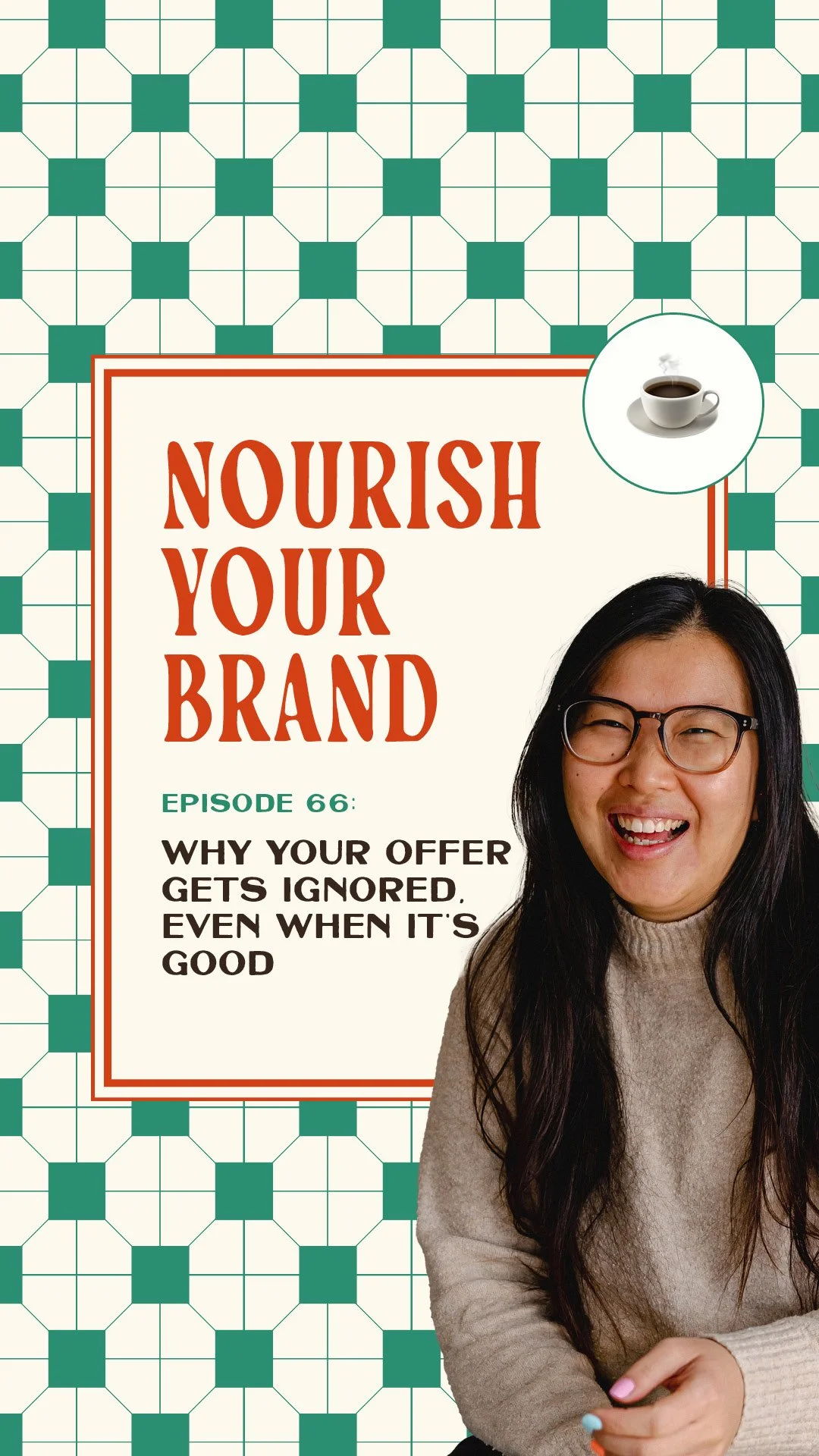
Ep 66. Why Your Offer Blends In (and How to Stand Out)
Nourish Your Brand · Episode 66
I'm going to say something that might sting a little. Your offer probably looks like everyone else's. Same fonts, same vibe, maybe the same pastel gradients, maybe the same can-of-template energy. Different name, same look.
That was me when I started Studio Coya, I went the other way, bold and colourful, thought I was bursting with personality, but I was still blending in. Standing out isn't about the specific colours or fonts, it's about whether your offer has its own distinct identity. Let's get into it.
Words can't fix a visual problem
When an offer blends in, whether it's the soft minimalist version or the bright playful version, people scroll past, not because they're not interested, but because they don't notice it's you. So you do the logical thing: go back to your messaging, tweak your angles, rewrite the caption, keep talking.
And the annoying part is your offer can be genuinely good, results and testimonials and all, and still get ignored, because you're not differentiating visually.
Messaging matters enormously, it's the foundation. But I could have the best messaging in the world and post consistently, and it still wouldn't land if visually it's not different.
Branding doesn't replace your copy, it amplifies it, it gives people something to latch onto while your words do their job. So if you're blending in, longer captions won't fix it, because people never stop long enough to read them. (This is the through-line of Episode 58 too)
Why this happens
There's an unspoken rule online that "good branding" looks a certain way, clean, minimal, beige, that editorial font. When you're trying to look professional, it's easy to end up looking like everyone else who's also trying to look professional.
Your audience isn't analysing your typography, they're scrolling and pattern-matching, making micro-decisions: have I seen this before? Is this for me? Do I care?
Picture five coffee shops on one street with the same storefront. You're not reading every menu, you go into the closest one. That's not laziness, it's how humans move through the world.
When your offer blends in, you're asking people to do the extra work to figure you out, and most won't, because they're busy. That's usually when you start doubting yourself, "I'm bad at selling, my offer isn't good enough", when actually your offer just isn't being seen. (The overlooked-offer problem from Episode 19)
The screenshot test
Take a screenshot of how you currently show your offer, your website or socials. Put it next to three or four people in your space. If you want to be brutal, scratch off everyone's names.
Can you instantly tell which one is yours? If the answer's "hmm, not sure", you're blending in, and blending in means fading into the background.
Three ways to make your offer distinct
Distinct doesn't mean loud, you don't suddenly need neon. It depends on your niche and personality. But three things help.
A visual anchor. Not necessarily a logo, just something that repeats every time you show your offer, so over time it becomes recognisable. The key is over time, recognition is built through repetition. For my Offer Oven, I kept repeating bread and baking, the oven, the warmth, the idea of something shaped and baked into being real. People started associating that world with the offer before reading the name.
Contrast. If everyone in your niche does the same layout and vibe, you need something that breaks the pattern. It can be subtle, a bolder type choice, an unexpected shape, one layout rule no one else follows. You're not shocking people, you're interrupting autopilot.
Personality. What does your offer feel like, playful, calm, luxury? And are your visuals actually communicating that? If your offer is meant to feel like being taken care of, it can't look like the discount bargain bin. People should feel what you're communicating before they read a word. (More on personality in Episode 2)
Ask yourself this week
Did your offer pass the screenshot test, or could it belong to anyone?
Do you have a visual anchor you repeat every single time?
Do your visuals make people feel what your offer delivers?
Where to go from here
Consider the possibility that your offer isn't bad, it's just blending in, which is great news, because it's fixable. You don't need to reinvent your business or become louder, you just need your visuals to work alongside your words.
Your micro-plan: pick a visual anchor, pick a contrast element, and use them every time you show your offer for the next week. If you'd like a second pair of eyes, that's exactly what I do in the Offer Oven. Book a free Brand Pairing call and let's chat.
Related episodes
Ep 58: Why you're doing everything right but sales are slow
Ep 19: Why your offer is being ignored (and how to fix it)
Ep 2: Why your brand feels bland (and the ingredient that fixes it)
Resources mentioned
Offer Oven – my 7-day sprint to make your offer visually distinct and recognisable
Brand Pairing call – a free 15-minute fit chat
Come say hi on Instagram: @studiocoya
Here's More…
Why does my offer get ignored even though it's good? Often because it blends in visually, so people don't notice it's yours and scroll past before they read your words. It's usually a visibility problem, not a quality or messaging one.
Can't I fix blending in with better copy? Not on its own. Social media is visual first, so if your offer doesn't stop people in the first place, they never reach your explanation. Your visuals need to do the first part of the job so your words can do the rest.
How do I make my offer look distinct? Use a repeated visual anchor, add contrast that breaks your niche's pattern, and make sure your visuals communicate your offer's personality. Distinct doesn't mean loud. That's exactly what the Offer Oven builds.
About the host
I'm Aiza, the brand chef behind Studio Coya, a branding studio with a food-themed twist. I help established coaches, creators and service providers brand their signature offers so their best work looks as good as it actually is, and sells like hotcakes.