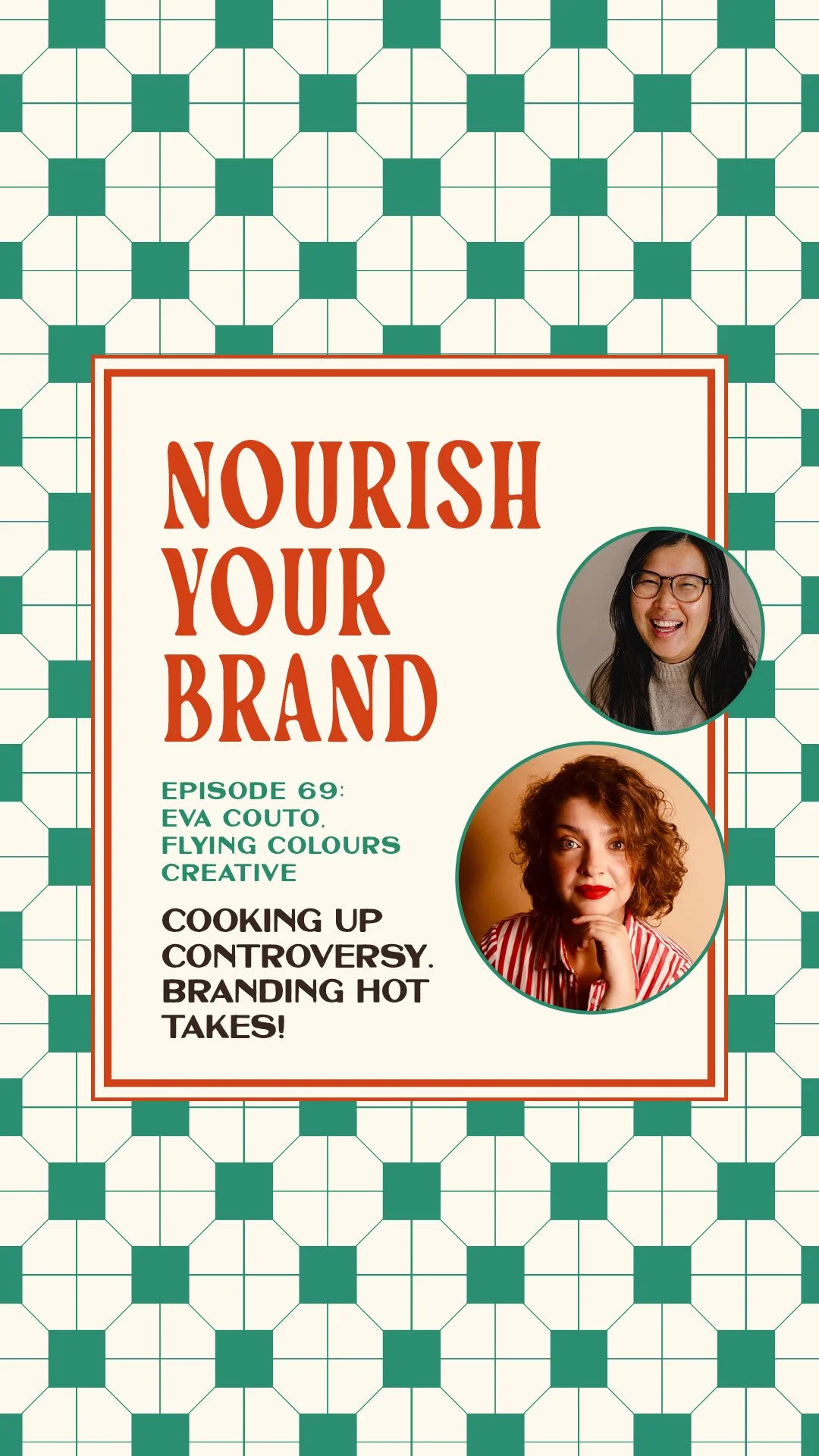
Ep 69. 6 Branding Hot Takes, with Eva Couto
Nourish Your Brand · Episode 69
Today's a little spicier than usual. I've got Eva Couto with me, founder of Flying Colours Creative, fellow brand designer and host of The Freak Show podcast, on a mission to bring colour back to the online business space.
The premise: two brand designers, six hot takes, no script. We recorded it in one go and split it across both our podcasts, the first three hot takes aired here on Nourish Your Brand, the last three over on Eva's show, The Freak Show.
I've pulled all six together in this post so you've got the whole spicy menu in one place, and the phrase "it depends" makes a lot of appearances. Let's get into it.
Hot take 1: "your logo doesn't matter"
We both landed on: it's not that your logo doesn't matter, it's that it doesn't matter as much as people think. Designers pour the most creative time into the logo, but it isn't the number-one thing your client notices or remembers, and for small businesses it mostly lives in the top-left of a website, a profile picture and an email footer.
The recognition that brands like Nike or McDonald's get from their logo is built over a very long time.
The real point: a brand identity is everything working together, colours, typography, photography, voice and the logo, and you'll notice if a piece is missing, but no single piece outranks the rest. (This is exactly the words-to-visuals, whole-identity idea from Episode 13)
Hot take 2: "you should brand your offers"
No prizes for guessing where I stand. But the nuance: you shouldn't brand every offer willy-nilly, that would dilute your main brand. Brand your signature offer, the one that's the entry point into your world (which I'd define by what people know you for, not just what makes the most money).
And it doesn't have to be a paid offer, branding your newsletter or podcast can give it visual importance and, crucially, make you more consistent with it. Eva branded her newsletter so it had a set structure and became easier to send.
A few caveats we both insisted on: keep the offer brand connected to your main brand (too far and people get confused), and don't brand a half-baked offer, branding can't fix an offer you haven't thought through, it just becomes makeup that feels boring in a few months. Branding is a tool, it has to solve a problem and serve a purpose. (This is the whole of Episode 47, and exactly what I do in the Offer Oven, my own branded signature offer)
Hot take 3: "trends are bad for brands"
Again, it depends. Trends aren't inherently bad, they can turn sour. Leaning on a trend can be smart for a pop-up, or as a creative exercise (taking a trending audio from another industry and making it work for you, which is exactly what designers do, spotting patterns people recognise and adapting them). Where it goes wrong is building your whole brand on a trend, like the iOS/analog aesthetic, because when it goes out of fashion, what then? Another rebrand?
The test: are you using the trend as leverage, or basing your entire existence on something that'll inevitably fade? If a trendy colour or font genuinely fits your brand, use it, just don't use it only because it's trendy. And longevity doesn't mean never changing, you can keep things fresh with small tweaks to the assets you already have, without a full rebrand. (Which is the right-reasons-to-rebrand conversation from Episode 16)
Listen to Part 2 on The Freak Show
Hot take 4: "premium brands shouldn't be playful and fun"
Wrong, with the usual caveat that it depends how you read "premium".
People hear premium and think high-ticket, luxury, costly, but premium and playful are not opposites. There's a whole sliding scale, and the trap is assuming fun means childish or unprofessional. My favourite example: Disney. It's a childlike world and genuinely premium (and expensive), because the experience aligns with the values behind it.
Eva's bugbear was the "should/shouldn't" of it all: who decided what professional has to look like? We've watched personal brands swing from golden-hour selfies to stern crossed-arms suits, as if nude nail polish makes you more productive.
Beige, black, white and grey are a perfectly valid choice if that's genuinely you, but you don't need them to be taken seriously. To be taken seriously, be serious about your business: provide a great client experience, be kind, deliver.
Personality lives in how you express yourself, and if someone reads your playful brand as not-premium, they're probably just not your person. (This is the personality-and-clarity work of Episode 2, and exactly what a Brand Recipe session gets clear before any visuals)
Hot take 5: "colour psychology is marketing fluff"
It becomes fluff when it's oversimplified into "blue means trust, red means passion, yellow means creativity". One colour does not mean one thing. There are a hundred blues, and each evokes something different, plus colour meaning is industry-dependent, audience-dependent and geography-dependent (white reads as purity in one culture and grief in another).
Red supposedly induces hunger, hence the fast-food chains, but does burgundy make you hungry? Probably not.
Light blue says "low-fat" in the food aisle and "playful" in a kids' brand. So the simplified colour wheel is fluff, but colour as a tool absolutely isn't. Eva's exercise nails it: map the colours your peers all use, then decide whether to follow the pattern (light blue to signal low-fat) or deliberately disrupt it to stand out.
And don't pick a colour just because it's your favourite, or just because a chart says it means "luxury", pick colours you're proud to actually use, that align with your vision. (More on standing out by breaking the pattern in Episode 37)
Hot take 6: "you don't need social media templates anymore"
Anytime a hot take starts with "you don't need", we both instinctively disagree, and this is no exception. Branded templates still earn their place: they build the recognition that makes someone stop mid-scroll because something looks unmistakably yours, and they're gold during a launch.
But it's not all-or-nothing. With the rise of the personal brand, there's also a place for native, unpolished, lifestyle content, and the magic is in the balance, which will be different for every business. Lean too far into Canva carousels and people can't see the human behind the brand; lean too far into travel selfies and they don't even realise you have something to sell.
A few things we both love: when a real brand is working behind the scenes, your professional shots and your iPhone shots blend instead of clashing (use the clothes, nail polish and home pieces already in your brand colours). And "branded templates" doesn't have to mean a bought pack, it can simply be consistent choices in the native app: the same fonts, a recurring sticker, your colours on the text.
The cardinal sin with bought template packs is changing your content to fit the template, when design exists to convey your message, not change it. Bespoke templates fit the content you actually post; generic packs make you post content you don't. (This is brand consistency across every touchpoint, the heart of the Brand Kitchen)
Ask yourself this week
Are you treating your logo as the whole brand, or one piece of the puzzle?
Which one offer is worth branding, and is it actually developed enough?
Are you using a trend as leverage, or building your brand on quicksand?
Are you assuming "premium" means stripping out all the personality?
Are you reading a colour-meaning chart, or reading your own industry's patterns?
Is your social media balanced between branded and human, or all the way to one end?
About the guest
Eva Couto is the brand and marketing designer behind Flying Colours Creative, on a mission to bring colour back to the online business space, with the belief that a brand is only as strong as it's usable.
She hosts The Freak Show podcast, where the second half of this conversation (hot takes four to six) originally aired. Find her at flyingcolourscreative.com and @flyingcolourscreative.
Related episodes
Ep 47: What is offer branding?
Ep 13: Brand identity: how to make your brand recognisable (Branding Pie Part 3)
Ep 16: The right and wrong reasons to rebrand
Resources mentioned
Eva Couto: flyingcolourscreative.com and @flyingcolourscreative
Offer Oven – my 7-day sprint to brand your signature offer
Brand Recipe – my 90-minute session to get your brand strategy clear before the visuals
Come say hi on Instagram: @studiocoya
About the host
I'm Aiza, the brand chef behind Studio Coya, a branding studio with a food-themed twist. I help established coaches, creators and service providers brand their signature offers so their best work looks as good as it actually is, and sells like hotcakes.