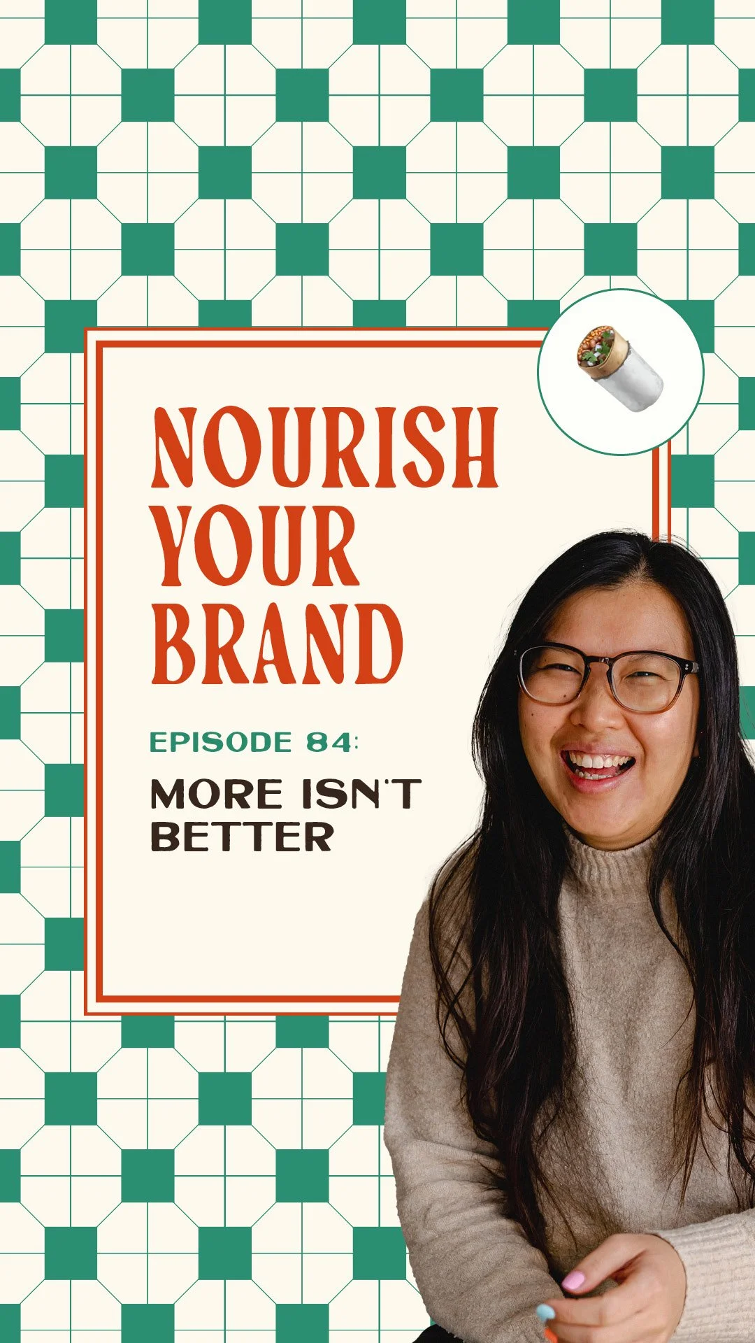
Ep 84. Why Your Branding Is Overstuffed (and How to Simplify Your Brand)
Nourish Your Brand · Episode 84
I caught myself doing the exact thing I tell my clients not to do.
I was in the middle of a client rebrand, and I added another colour. Oh yeah, that works. Then maybe this needs another font. Then a few more icons. A bit more on top of that.
Every single addition felt like an improvement. It didn't feel like a mistake, it felt like being thorough, like putting the effort in. Let's get into why more branding is one of the most common branding mistakes out there.
How an overstuffed brand identity sneaks up on you
Then I stepped back, looked at the whole thing, and went… okay, this is way too much.
And the annoying part? I couldn't tell you what exactly tipped it over the edge. There was no single moment where I thought "that's too far." It was fine, and then it wasn't, and I hadn't noticed while I was doing it.
So I went back to the goal of the brand. What was this actually meant to be communicating? I looked at everything I'd added, and none of it was doing anything for the brand. I'd just added it because surely more is better, right?
I was adding to the noise.
In the end I cut a lot of it. A shame, because I'd spent hours building that brand identity. But lucky too, because I caught it before it got anywhere near the client. A bit of extra time was a cheap price for the lesson.
What overstuffed branding does to your brand
Here's how I think about an overstuffed brand now. A burrito is brilliant when it's balanced. You can hold it, every bite gets you a bit of everything, it works.
So you think, why not more rice? More guacamole? Guac makes everything better, obviously.
And then you go to wrap it up, and the wrap won't hold it all. Each thing you added was a fine decision on its own. But add too much of everything without keeping an eye on the wrap, and it's a mess in your hands. It splits, it spills, one bite and it's everywhere.
Branding is exactly the same. It falls apart the moment someone actually tries to hold it or experience it.
Adding a lot isn't generous. It's making your brand harder to hold.
Every brand element needs a reason
It usually starts so innocently. An extra brand colour. One more graphic. A new accent font, because you fancy a bit of whimsy.
On its own, every element passes the test. You can point at each one and go "yeah, that's on brand, I like it." That's not the problem.
The problem is when your sales page has five colours, three fonts, ten icons, arrows, a background pattern, all of it fighting for attention in every corner. Now your client can't find the information they actually came for. Your voice and your personality can't get through. It just reads as… a lot.
And here's the sting. The thing you're proud of, your personality, your values, your offer, that's what gets buried. The strongest thing you've got is the thing paying the price.
This is why I keep banging on about branding needing a reason. Every element should be doing a job, or working with the others to do one. If it isn't, it's not sitting there harmlessly. It's taking up room something more important needed.
Half of what I do in a branding sprint is point at things and ask, "what's that for?" And so often the client goes, "oh, that's the bit I actually want to bring out." The rest we happily bin.
It's not you, it's your brain
So we all know we should stop adding and start taking away. Why do we keep doing it anyway?
There's actual research on this, which made me feel better about myself. Someone ran an experiment with a wonky Lego bridge, one side higher than the other, and asked people to stabilise it. Most people added a brick. Almost nobody thought to remove one, even though that fixes it just as well.
We've got an addition bias. Given a problem, our brains reach for "add something" and skip right past "take something away," even though subtracting is usually cheaper, faster and works better.
It's not a taste thing or a discipline thing. Our brains just don't offer subtraction as an option unless we consciously go looking for it.
And for business owners, adding feels productive. You've made a thing, you can point at it. Taking away feels like losing, especially when you've paid for it.
Why taking away feels like losing
Nobody wakes up and decides to make their brand messy. It happens one harmless addition at a time. Things evolve, you pay for something you thought you needed, and it builds up.
So the move is to go through your brand and find the element you don't really use, the one that isn't adding anything, and remove it.
Let me be specific, because this isn't the thing you've gone off or got bored of, that's a different problem. It's the one where, if you think about it properly, you have to admit it isn't doing a job. It isn't communicating your personality or a value. That's the one to look at first.
The question I ask every single time now is just: what is this doing? And most of the time the honest answer is "I don't know." So it goes.
I know how hard removing something feels when you've invested in it. You paid someone, or you spent hours on it. That's the sunk cost fallacy, keeping something purely because you've already put money or effort in.
But that money and time are already spent. You're not getting them back whether you keep it or bin it. Keeping it is the thing that costs you now, in clients having to work harder to figure out what you're trying to say.
So don't think of it as throwing it away. You're just not letting it take up room anymore.
Ask yourself this week
Pull up your sales page, or wherever your offer lives.
Pick one element and ask what job it's doing. Not whether you like it, what it's doing.
If you come up blank, that's your answer for what to look at first.
Where to go from here
If that made you think "oh, there might be a few of these," I've got something for you.
It's my Brand Roast, and I've turned it into a self-assessment, because a few of you told me being roasted by someone else gave you the scaries. It's a series of honest questions that walk through your brand properly and show you where the opportunities are: what's working, what's not, what's doing a job and what isn't.
Do the self-assessment and leave it there if you like. And if you get brave and want my take on what you found, there's an option at the end to book a live Brand Roast with me. I promise to be gentle. No pressure either way.
Have a think, and see whether you've overstuffed your burrito.
Related episodes
Ep 41: Why cute branding isn't enough
Ep 3: Is your branding all over the place? How to rein it in
Ep 33: 3 branding mistakes that are costing you clients
Resources mentioned
Brand Roast self-assessment – my honest walk-through of what's working in your brand and what isn't, with the option to book a live Brand Roast at the end
Offer Oven – my 7-day sprint to brand your signature offer with every element earning its place
Come say hi on Instagram: @studiocoya
Here's More…
How do I know if my brand is overstuffed? Look at one page and count the competing elements: colours, fonts, icons, patterns. If a reader would struggle to find the key information or feel your personality through the noise, it's overstuffed. Each element should be doing a clear job.
Why is it so hard to remove things from my brand? Two reasons: addition bias (our brains reach for adding, not subtracting) and the sunk cost fallacy (keeping something because you've already invested in it). But that time and money are already spent, keeping the clutter only costs you more.
What's the one question to ask about each element? "What is this doing?" Not whether you like it, but what job it's actually performing, communicating your personality, a value, or guiding your client. If you can't answer, that's the first thing to reconsider.
About the host
I'm Aiza, the brand chef behind Studio Coya, a branding studio with a food-themed twist. I help established coaches, creators and service providers brand their signature offers so their best work looks as good as it actually is, and sells like hotcakes.